1.31.2006


the other side of the invitation Posted by Picasa

Lets play squash again! This pain is going away... Posted by Picasa

I believe I already posted this drawing by Shrigley (colours are inverted). Just in case I didn't... Posted by Picasa

Cover from a fascinating dysfunctional book by Jake Chapman: MEATphysics - purely physical Posted by Picasa

Shrigley drawing - he puts things in such a simple way (I messed up the white backgroud with some black) Posted by Picasa

There is a lot to say about this proposal I made for the degree show poster:
-I was taking the piss
-I was trying to do an anti-poster
-It is related to Hirst's spot paintings, and the Chapman Brothers smile.
-Its a stereographic image and it wasn't intentionally like that.
-It has to do with ecstasy and other drugs.
-It's a counter proposal after I had to deal with lots of stupid girls comments on a good poster I did before.
-the @ symbol is suppose to make you read it like this: Fresh me at Coventry Degree Show
-the pink is obviously punk, porno and girly.
-The smile is the most dysfunctional one I could find.
-You would rather like because you are stupid or because you have a good sense of humour ("tong on the chick!").
-Its effective as an advert for an art magazine. Posted by Picasa

Obvious thoughts on web design

Enjoy web designing tonight. And try to smile in the morning when you feel sleepy.
I just realized I’m a slave of the previous me. Why couldn’t I have all the work done already? I’m also a slave of my future... A slave of the dream and aspirations of those people I want to become. One thing is for sure: the present should be enslaved by both future and past - otherwise dreams will always be just dreams.

Websites shouldn’t have any music in auto play because most people already have their own music. – The music policy will change in this blog now on. If you want music just click play…

The quality of a web address is rated according to 2 criteria: simplicity and how professional it sounds. If you can chose your domain it should always be .com because it is universal and not local like the .co.uk or the .pt. Unfortunately .net sounds cheap for absolutely no reason.

The structure of the site should be obvious. I hate websites where I can’t tell how much more I still have to see or read. I’m quite annoyed by complex moving menus.

Flash is great to show images in a more professional way as well as making transitions smooth. I need to upgrade that later on.

Unfortunately it is mandatory to have an option to see the same information in Portuguese. A bit more work but… what kind of Portuguese would I be if didn’t do it?

1.29.2006


tu... sempre foste tu... Posted by Picasa

His name is Alfredo, Valentim, McFery... and some other times: Manu. Posted by Picasa

Last night... Posted by Picasa

Danço com a descoberta imprevisivel de que sou apenas uma vítima de uma memória perdida. Momentos que passaram e de que sinto falta. As esperanças são apenas sombras que recobrem o mundo como se fossem luzes. Se forem mesmo luzes são lasers que nos carbonizam à sua passagem. Porque as mulheres que não daçam são sempre as mais perigosas. São sempre a perdição. As que nos fazem dançar por dentro são sempre as vuluptuosas Bond Girls... E são as que realmente me formam e deformam como homem.
É tudo o que fica por acontecer que me fascina neste mundo. O potencial que não arde, a força de não move... E na certeza de que o ardor é já parte de mim, pergunto-me qual é a rapariga que toma o pequeno almoço a olhar para um adorno qualquer ou talvez um ser estranho que se perdeu por sítios muito pouco comuns. E na esperança de que a próxima Cat Woman não me rasgue a pele, espero pacientemente no único desfiladeiro onde me interessa caçar de embuscada... Já muito mais felino e mudado espero entre as rochas pela boca que diz sempre menos do que sente. Posted by Picasa

1.27.2006

In this world […] you must be all so smart or all so pleasant… for years I was smart, I recommend pleasant.

From the film Harvey

Website furtadosantos.com in progress

Should I have an extremely simple layout?
I really need to try my best to keep it that way.

Should I stick to stills, video and text or should I do flash website in the future? Kiss rule: Keep It Simple Stupid.

Side bar with stills, text, project name's, cronological?
It needs thumbnails because it simplifies the search for a specific work. But some of those thumbnails, maybe the initial ones, should have text leading to: exhibitions, projects, different years or plain information.

Should the background be dark or light?
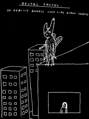
If I make it dark it will start looking predictable because of the blog having a black background... but I would be able to use some of the images I used here...
On the other hand a light background (almost completely white) is very likely to last longer visaully.

Font?
Arial? Is it boring?

HUmmm...
I have to start doing it instead of thinking about these things.
First step make a folder with all the files: images, videos, text... Then start playing around with it.

It's time to try my luck once again.

1.26.2006


read Claire Bishop Posted by Picasa

voID memories Posted by Picasa

Installation Art quote

Dispite the vast number of installations produced in the last 40 years, the majority of hte examples features here date from 1965 to 1975, the decade in which installation art come of age.This is because it is at this time that the main theoretical impulses behind installation art come into focus: ideas of heightened immediacy, of the decentred subject (Barthes, Foucault, Lacan, Derrida), and of activated spectatorship as political in implication.

Water-color 4 Posted by Picasa

Water-color 3 Posted by Picasa

The Second Coming Posted by Picasa

Definitions of acculturate on the Web:

assimilate culturally
wordnet.princeton.edu/perl/webwn


a policy used by the Bureau of Indian Affairs to destroy Aboriginal Indigenous communities, specifically by replacing Aboriginal Indigenous language, culture, and values with Euro-American ones.
www.maquah.net/We_Have_The_Right_To_Exist/WeHaveTheRight_26Glossary.html


Acculturation is the obtainment of culture by an individual or a group of people. The term originally applied only to the process concerning a foreign culture, from the acculturing or accultured recipient point of view, having this foreign culture added and mixed with that of his or her already existing one acquired since birth.
en.wikipedia.org/wiki/Acculturate

Mistakes...

I believe Becket once wrote:

Fail once. Fail again... Fail better.

If it wasn't exactly like this it was similar. Today I realized I forgot to mention on my MA application a prize I won in June last year for my academic performance. How stupid is that? It's ridiculous. Next year I'll fail better if necessary.

Image for invitation (Pharma Mural gathering) Posted by Picasa

Disturbing conversation with Keith Sonnier

Sculpture magazine January/February 2006

...the way you incorporate whatever you find around you. Is that an accurate assessment?
KS: Anybody who is worth their grain of salt has to use the world around them. An artist's responsibility is to ACCULTURATE the world. That's what one does. And you can't do it properly without some kind of "form Language" - without some kind of system of reading and looking at the world. The better equipped you are to ACCULTURATE, the better reading you can give of the world around you.


...

How do you see art in relation to Language?

KS: I think that the works are about perception, but I also think that there are many ways to "read". I'm fascinated by language, but I believe we need to think of it in a much more contemporary sense. The written word is no longer just the written word. There’s the spoken word, there's the picture. Because of technology, we now have a very short-circuited kind of language - a layered language - and I think that's what I like my words to do. I like to think that this is how people perceive. That's why I became interested in the media, I think, because of new language base.


The first quote just shot-circuits my brain... I think I disagree... but I like the feeling I get from his words (maybe it’s because I use found objects).

The second quote is the answer to a problem I was having while trying to put together my Thesis topic (Eclectic Reflections on Language and the Experience of Art) with my 3D practice.

Mind/Body Posted by Picasa

Potencial de instala��o  Posted by Picasa

Posted by Picasa

1.25.2006


Sir John Everett Millais Bt
Ophelia, 1851-2

Probably the most famous image of Ophelia. The model was Elizabeth Siddal, who posed for hours in a tub of water (it was supposed to be heated by lamps, but they probably went out at some point) and contracted pneumonia shortly thereafter. The meticulous detail in the nature scene surrounding her is often cited as a prime example of the Pre-Raphaelite Brotherhood's original ideals--which actually had little to do with the lushly romantic portrayals of women that soon became associated with the movement. This painting is just one reason Lizzie is often closely associated with the Ophelia image; she would later identify herself with the unfortunate maiden in her poem "A Year and a Day".
Permanently exhibited in Tate Britain  Posted by Picasa

Stuart Brisley, And for Today... Nothing, 1972, Collection of the Artist Posted by Picasa

The inverted bloody rat... Posted by Picasa

And for today we have Disney... Posted by Picasa

Water-color 2 (Ico-reference) Posted by Picasa

Before time started Posted by Picasa